UX/UI para desenvolvedores
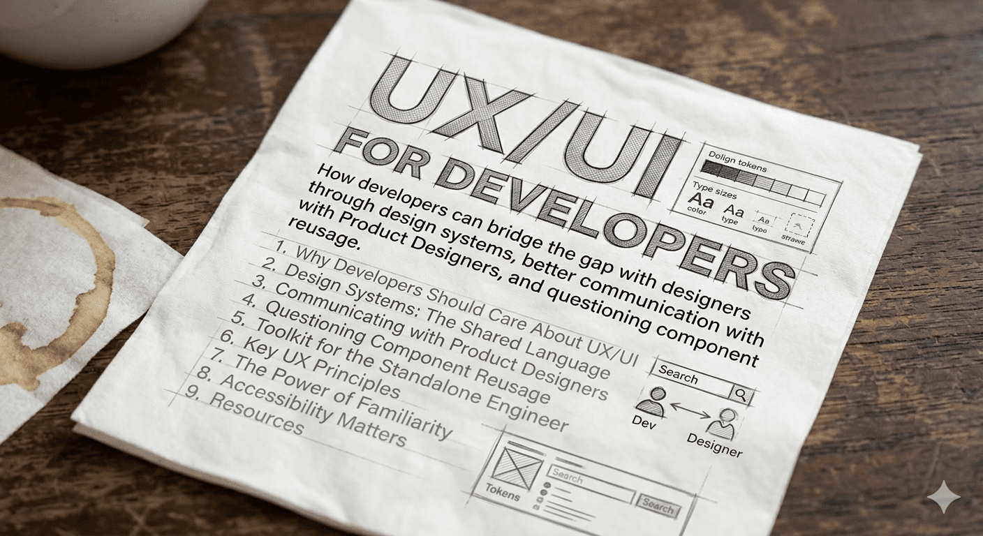

UX/UI para Desenvolvedores
Como desenvolvedores podem diminuir a distancia com designers atraves de design systems, melhor comunicacao com Product Designers e questionamento sobre reuso de componentes.
Neste post:
- Por que Desenvolvedores Devem se Importar com UX/UI
- Design Systems: A Linguagem Compartilhada
- Kit de Ferramentas para o Engenheiro Solo
- Comunicacao com Product Designers
- Questionando o Reuso de Componentes
- Principios de UX que Todo Dev Precisa Conhecer
- O Poder da Familiaridade
- Acessibilidade Importa
- Recursos
Por que Desenvolvedores Devem se Importar com UX/UI
Design nao e so trabalho de designer. Todo desenvolvedor toma decisoes de UX diariamente — escolhendo um estado de loading, tratando um erro, decidindo como um formulario valida. Entender os fundamentos de UX te torna um engenheiro melhor e um colaborador melhor.
Como diz o curso de Product Design da Udacity pelo Google: "Design e um processo sistematico e orientado por dados." Nao se trata de deixar bonito — se trata de resolver problemas para pessoas reais.
"Bom design e invisivel. Design ruim esta em todo lugar."
Design Systems: A Linguagem Compartilhada
Um Design System nao e apenas uma biblioteca de componentes. E o contrato entre designers e desenvolvedores — um vocabulario compartilhado que elimina ambiguidade.
O que um Design System Deve Fornecer
- Tokens: Cores, espacamento, tipografia, sombras — os atomos da sua UI
- Componentes: Botoes, inputs, modais — blocos reutilizaveis
- Padroes: Como componentes se compoem (formularios, navegacao, tabelas de dados)
- Diretrizes: Quando usar o que, e por que
Atomic Design
O Atomic Design de Brad Frost divide interfaces em niveis hierarquicos:
| Nivel | Descricao | Exemplo |
|---|---|---|
| Atomos | Elementos HTML basicos | Botao, Input, Label |
| Moleculas | Grupos de atomos trabalhando juntos | Barra de busca (input + botao) |
| Organismos | Secoes complexas de UI | Header, Card de Produto |
| Templates | Layouts em nivel de pagina | Layout de dashboard |
| Paginas | Instancias especificas de templates | Dashboard do usuario com dados reais |
Alem do modelo original, alguns times adicionam:
- Quarks: Elementos que so aparecem dentro de um organismo (nunca isolados)
- Bosons: Elementos abstratos como grids e paletas de cores
Ferramentas e Referencias
- Figma — O padrao da industria para colaboracao em design
- Origami Studio — Ferramenta de prototipagem da Meta para design e teste de interacoes e animacoes
- Radix UI — Primitivos de componentes acessiveis e sem estilo
- Flowbite — Biblioteca de componentes Tailwind CSS
- Tailwind UI — Componentes oficiais do Tailwind
- Design Systems Library — Colecao de design systems publicos
Kit de Ferramentas para o Engenheiro Solo
Voce nao tem um time de design. Ou talvez seu designer esteja espalhado em 5 squads. De qualquer forma, voce precisa entregar algo que pareca e funcione profissionalmente. Essas ferramentas te dao esse superpoder.
Ecossistema Tailwind CSS
Tailwind CSS e o melhor amigo do desenvolvedor para UI. Ele te da um design system pronto — espacamento consistente, cores, tipografia — sem escrever CSS customizado.
Por que Tailwind funciona para desenvolvedores:
- Impoe restricoes de design (voce escolhe de uma escala, nao valores arbitrarios)
- Design responsivo com prefixos de breakpoint (
md:,lg:) - Suporte a dark mode embutido (
dark:) - Utility-first significa que voce raramente troca de contexto para arquivos CSS
Bibliotecas de Componentes (baseadas em Tailwind)
Essas bibliotecas te dao componentes prontos para producao, sem comecar do zero:
| Biblioteca | Melhor Para | Destaques |
|---|---|---|
| shadcn/ui | Aplicacoes completas | Componentes copy-paste, totalmente customizaveis, construidos com Radix + Tailwind |
| Tailwind UI | Templates premium | Time oficial do Tailwind, componentes polidos para marketing/apps |
| Headless UI | Primitivos acessiveis | Pelo time do Tailwind, sem estilo mas totalmente acessiveis |
| DaisyUI | Prototipagem rapida | Nomes de classes semanticos sobre Tailwind, tematizavel |
| Flowbite | Sites de marketing e dashboards | Grande conjunto de componentes com suporte a vanilla JS, React e Vue |
| NextUI | Apps Next.js | Defaults modernos e bonitos, construido com Tailwind + React Aria |
| Tremor | Dashboards e visualizacao de dados | Graficos, KPIs e componentes de dados para Tailwind |
| Catalyst | UI de aplicacoes | Kit oficial de UI para aplicacoes do Tailwind |
Bibliotecas Headless / Sem Estilo
Quando voce quer controle total sobre o estilo mas precisa de acessibilidade e interacoes de teclado resolvidas:
- Radix UI — Primitivos sem estilo (Dialog, Dropdown, Tooltip, etc.)
- React Aria — Hooks de acessibilidade da Adobe
- Headless UI — Componentes acessiveis do Tailwind Labs
- Ark UI — Pelo time do Chakra UI, agnistico de framework
Design Systems Completos
Se voce quer uma abordagem opinada e com tudo incluso:
- Material UI (MUI) — Material Design do Google para React
- Chakra UI — Acessivel, tematizavel, otima DX
- Ant Design — Nivel enterprise, apps com muitos dados
- Mantine — 100+ hooks e componentes, documentacao excelente
Prototipagem e Design de Interacao
Antes de escrever codigo, valide suas ideias:
- Origami Studio — Ferramenta da Meta para criar prototipos interativos com animacoes complexas e gestos. Otimo para testar micro-interacoes antes de implementa-las
- Figma — Design, prototipo e colaboracao em uma ferramenta
- Framer — Ferramenta de design com exportacao de codigo pronto para producao
- Pop — Transforme esbocos em papel em prototipos interativos
- Balsamiq — Wireframing de baixa fidelidade
Icones e Ilustracoes
- Lucide — Conjunto de icones limpo e consistente (fork do Feather Icons)
- Heroicons — Pelo time do Tailwind
- Phosphor Icons — Familia de icones flexivel
- Undraw — Ilustracoes open-source
- Open Doodles — Ilustracoes gratuitas estilo rascunho
- Ouch (icons8) — Ilustracoes vetoriais
- Isoflat — Ilustracoes isometricas
Comunicacao com Product Designers
A maior fonte de atrito entre desenvolvedores e designers nao e habilidade — e comunicacao. Veja como melhorar.
Antes de Construir: Faca as Perguntas Certas
- "Qual problema estamos resolvendo?" — Nao "qual tela eu construo?" Entender o por que muda como voce implementa.
- "Quais sao os casos extremos?" — Estados vazios, estados de erro, estados de loading, texto longo, dados faltando. Designers frequentemente focam no caminho feliz. Seu trabalho e perguntar sobre todo o resto.
- "Isso e um padrao novo ou existente?" — Antes de construir algo novo, verifique se o design system ja tem.
- "Qual e a interacao?" — Mockups estaticos nao mostram estados de hover, transicoes, navegacao por teclado ou comportamento de leitor de tela.
- "Como isso fica no mobile?" — Comportamento responsivo e frequentemente assumido mas nao especificado.
Durante o Desenvolvimento: Comunique Tradeoffs
Designers propoem; engenheiros expoem restricoes. Isso nao e confronto — e colaboracao.
- "Esse dropdown customizado vai levar 3x mais tempo que usar nosso componente Select existente. A diferenca visual e minima. Podemos reutilizar?"
- "Essa animacao e possivel mas vai degradar a performance em dispositivos mais fracos. Aqui esta uma alternativa mais simples que atinge a mesma sensacao."
- "A API nao retorna esses dados em uma chamada so. Podemos adicionar um estado de loading ou mudar o layout."
Specs que Funcionam
Um otimo artigo sobre o tema: Desenhando pra web — Como venho melhorando ao desenhar UI com specs melhores para os devs
Boas specs devem incluir:
- Espacamento em unidades consistentes (use rem — relativo ao tamanho da fonte raiz, nao pixels)
- Tokens de cor (nao codigos hex —
--color-primary, nao#3b6dab) - Estados dos componentes (default, hover, active, disabled, error, loading)
- Breakpoints responsivos
Questionando o Reuso de Componentes
"Devo reutilizar esse componente?" e uma das perguntas mais importantes que um desenvolvedor pode fazer. A resposta nem sempre e sim.
Quando Reutilizar
- O componente resolve o mesmo problema em um contexto diferente
- O contrato visual e comportamental e o mesmo
- Extende-lo nao exige gambiarras na API
Quando NAO Reutilizar
- Voce esta adicionando props como
isSpecialCase,variant="headerButDifferent"ouhideWhenUsedInSidebar - O componente cresceu para 15+ props, a maioria condicionais
- Alterar para um caso de uso arrisca quebrar outros 10
A Conversa com seu PD
Quando um designer te da um mockup que parece quase igual a um componente existente:
"Opa, isso parece similar ao nosso componente
DataTablemas com algumas diferencas — a altura da linha e diferente e tem um modo de edicao inline. Devemos: A) Estender oDataTablecom essas features (risco: complexidade), B) Criar um novo componenteEditableTable(risco: duplicacao), ou C) Revisar o design para alinhar com nossos padroes existentes?"
A opcao C frequentemente e a melhor resposta. Consistencia beneficia os usuarios mais do que originalidade pixel-perfect.
Principios de UX que Todo Dev Precisa Conhecer
10 Heuristicas de Usabilidade de Nielsen
Estas sao a base. Todo desenvolvedor deveria internaliza-las:
- Visibilidade do estado do sistema — Sempre mostre ao usuario o que esta acontecendo (spinners de loading, barras de progresso, mensagens de sucesso)
- Correspondencia entre o sistema e o mundo real — Use linguagem e conceitos familiares ao usuario, nao jargao tecnico
- Controle e liberdade do usuario — Forneca desfazer, cancelar, voltar. Deixe usuarios escaparem de erros
- Consistencia e padroes — Siga as convencoes da plataforma. Nao reinvente a roda
- Prevencao de erros — Previna erros antes que acontecam (confirmacoes, mascaras de input, desabilitar acoes invalidas)
- Reconhecimento em vez de memorizacao — Mostre opcoes em vez de exigir que usuarios as lembrem
- Flexibilidade e eficiencia de uso — Suporte tanto usuarios novatos quanto avancados (atalhos de teclado, defaults)
- Estetica e design minimalista — Cada elemento extra compete com informacao relevante
- Ajude usuarios a reconhecer, diagnosticar e recuperar de erros — Mensagens de erro claras que expliquem o que deu errado e como corrigir
- Ajuda e documentacao — Forneca ajuda contextual quando necessario
Fonte: 10 heuristicas de Nielsen
O Framework B.I.A.S.
Toda vez que usuarios interagem com seu produto, eles:
- Block (Bloquear) — Filtram a informacao
- Interpret (Interpretar) — Buscam significado
- Act (Agir) — Tomam decisoes dentro de um tempo determinado
- Store (Armazenar) — Lembram de partes da interacao
Para melhorar qualquer experiencia, entenda os principios psicologicos que afetam cada etapa. Mais em growth.design.
Conceitos de Design de Don Norman
Do curso Intro to the Design of Everyday Things:
- Affordance — O que um objeto sugere que voce pode fazer com ele. Um botao sugere que pode ser clicado.
- Signifier (Significante) — Pistas visuais que indicam como interagir. Um texto sublinhado significa um link.
- Modelo Conceitual — O modelo mental do usuario de como algo funciona.
- Golfo de Execucao — A lacuna entre o que o usuario quer fazer e descobrir como fazer (descoberta).
- Golfo de Avaliacao — A lacuna entre o que aconteceu e entender o que significa (feedback).
Bom design tem empatia pelas pessoas que vao usa-lo.
O Poder da Familiaridade
"Interacoes previsiveis criam confianca no produto e na marca." — Nielsen
Isso e critico para desenvolvedores entenderem: sua vontade de elegancia tecnica nunca deve sobrepor a familiaridade do usuario. Se um <select> padrao funciona, nao construa um customizado so porque voce pode.
Usuarios sao mais tradicionais do que parecem. Eles querem o que ja conhecem. Sem surpresas.
Usuario e mais tradicional que igreja ortodoxa. Ele quer sempre o que ja sabe. Sem nhenhenhé.
Como Construir Interfaces Familiares
-
Estude referencias obsessivamente:
- Page Flows — Gravacoes reais de interacao de produtos
- Mobbin — Padroes de design mobile e web
- Land-book — Inspiracao de landing pages
- SaaS Frame — Padroes de UI para SaaS
- Fonts in Use — Tipografia em contexto
- Empty States — Designs de estados vazios
-
Repita o que funciona. Como um musico praticando escalas ou um lutador treinando o mesmo chute — maestria vem da repeticao, nao da invencao.
-
Teste com usuarios reais. Como um grande orientador disse: "Va perguntar ao mundo quando se sentir lento, travado ou perdido." Mostre seu trabalho para estranhos. O feedback ainda precisa ser interpretado — nao e uma lista de tarefas — mas vai mudar sua perspectiva.
Recursos de Pratica
- sharpen.design — Prompts de design
- uxtools.co/challenges — Desafios de UX
- dailyui.co — Desafios diarios de UI design
- goodbrief.io — Briefs aleatorios de design
Acessibilidade Importa
Acessibilidade nao e uma feature — e um requisito. E desenvolvedores sao a ultima linha de defesa.
Vitorias Rapidas
- Contraste de cores: Use o Colorable para verificar suas combinacoes
- HTML semantico: Use
<button>para botoes,<nav>para navegacao. Leitores de tela dependem disso - Navegacao por teclado: Todo elemento interativo deve ser alcancavel e operavel apenas com teclado
- Texto alternativo: Toda imagem significativa precisa de texto alt descritivo
- Nao dependa so de cor: 8% dos homens sao daltonicos. Use icones, padroes ou texto junto com cor
Leitura recomendada:
Referencia Rapida de Tipografia
Entender tipos de fonte ajuda a discutir decisoes de design:
| Tipo | Caracteristicas | Transmite |
|---|---|---|
| Serifada | Hastes/prolongamentos nas extremidades das letras | Seriedade, formalidade, tradicao |
| Sem serifa | Limpa, sem extensoes | Clareza, simplicidade, modernidade |
| Caligrafica | Similar a escrita manual, formal ou casual | Elegancia, personalidade |
| Decorativa | Unica, especifica de marca (Lego, Fanta) | Criatividade, descontracao |
Recursos
Cursos
- Udacity - Product Design by Google
- Coursera - Introduction to User Experience Design
- Alura - Fundamentos de UX: Entenda a experiencia de usuario
- Alura - UX Produto: monitore, mensure e teste o seu projeto
- Alura - Figma: Componentes da interface
- Alura - Figma: Refinando o visual da interface
- Alura - UX Research: Mapeando a jornada do usuario
- Alura - UX Research: Analise de concorrentes
- Alura - UX Research: entrevistas com equipes internas
- Alura - UX Research: entrevistas com usuarios
- Alura - Teste de usabilidade parte 1
- Alura - Teste de Usabilidade parte 2
- Alura - UX Strategy: divergindo e afunilando ideias
- Alura - Design Thinking: Viabilizando solucoes
- Hack Design
Artigos
- Qual a diferenca entre designer de produto, UX Designer e UX/UI Designer?
- Afinal, o que e realmente UX?
- O que faz um bom design?
- Uma lista abrangente (e honesta) de cliches de UX
- Designers, own your feedback
- Pensar em produto X pensar em projeto
- Design Better Data Tables
- Deliberate Product Design Simplicity
- Desenhando pra web — specs melhores para os devs
Livros
- Nao Me Faca Pensar — Steve Krug
- Hooked (Engajado) — Nir Eyal
- Roube Como um Artista — Austin Kleon
Bibliotecas e Ferramentas
- UX Library
- Origami Studio — Ferramenta de prototipagem interativa da Meta
- SVG Transform Tools
- Jitter Video — Animacoes de UI
- Framer Motion — Biblioteca de animacoes para React
Animacoes em React
- Framer Motion — Animacoes prontas para producao em React
- React Native Reanimated — Animacoes performaticas para React Native
- Moti — Animacoes universais para React Native (construido sobre Reanimated)
A experiencia e boa quando e familiar. Quando eu sei onde estou. Quando nao me perco. E sei como posso chegar onde quero.